For our specific use case here, we want to provide a nice visual for customer density. Let’s assume we have a handy dataset of our customers, each of which has a latitude and longitude for their house. We want to start to understand some basic properties about the geospatial arrangement of our customer base. How dense are they?
We’re going to use the Python library tilemapbase for building our map layers
here. The API exposed by tilemapbase is fairly quirky and pretty low-level,
requiring a fair amount of familiarity with the implementation details to
successfully use.
To start, we’re going to import a bunch of modules that will be useful as we build up our end result. Note that the code below will be presented mostly in notebook fashion.
|
|
Then there’s some boilerplate needed to get things rolling. I’m using Seaborn on top of matplotlib, so we set some theme stuff and then do the one-time dance needed to prepare tilemapbase for further use. We’re using OpenStreetMap as our source for map data.
|
|
Let’s grab our customer file into a generic Pandas dataframe. For our simple example, let’s assume we have a very basic set of information about each customer. I’ve just mocked up some synthetic data corresponding to North Central Arkansas where I live. In a real example, you probably have many attributes that you would carry through the analysis, but here, we focus on just where the customer lives and what branch they’re assigned to.
|
|
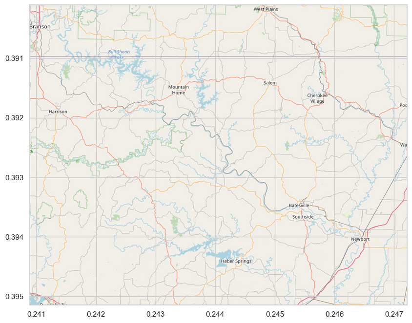
First, let’s just use this dataset to draw an appropriate region of the map to contain all our data points. To do this, we compute the bounding box that contains our min and max of both latitude and longitude, with a padding factor in each dimension to provide a bit of margin around all of our data points.
|
|

Plotting a basic extent on a map
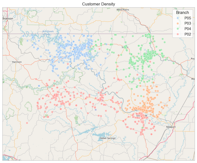
So we have our map. Let’s now add the individual data points corresponding to each customer.
|
|

Adding a scatter plot to the map
There’s a bit more going on in this code. We have to project the coordinates
from the standard latitude/longitude pairs into the coordinate space used by
tilemapbase. To do this, I create a list of tuples. The first element of each
tuple is a (lat, lon) pair. The second is a string with the branch code. I then
use a list comprehension to extract the result of tilemapbase.project on the
coordinates along with the branch code. Then we create a data frame with the
transformed coordinates and branch labels and use that to plot our scatter plot.
The axis ticks aren’t especially useful here, so we hide them and put a title
up.
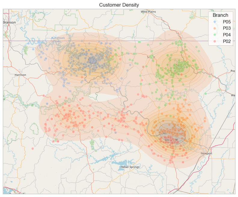
We could continue further by, e.g., adding a density plot on top of the scatter plot.
|
|

Adding a density plot to the map
The basic idea with tilemapbase is just to project your coordinates, plot the
map using the Plotter object, and then continue to build on the axes using
whatever normal matplotlib/seaborn code you like.